Google originally purchased QuickOffice in June 2012, but only made the iOS and Android apps available in late 2013. By default, QuickOffice is built-in with Android 4.4 KitKat. This means users can create and edit documents straight out-of-the-box without even visiting the Google Play store.
Now Google has two office suites, QuickOffice and Google Drive, with nearly two identical interfaces. Which one should you use? Drive is no slouch by any means, but if you’re looking to create a document on the go that includes tables, images or charts, QuickOffice is your go-to app. Overall, the interface is easier to use and all of the editing takes place offline, so it feels like a smoother experience.
Start by launching the QuickOffice app from the apps page and you’ll be presented with a list of options for opening and creating new files, together with a list of recent files.
The same options are available from the toolbar at the top of the page by clicking the ‘+’ icon. If you choose to open an existing file, you can select from recent documents, your Google Drive account and the device’s downloads folder. Pro tip; select the file picker settings from the menu and enable ‘display advanced devices’ option and you can now select files from your device’s internal storage.
When creating a new document, select a new Word document, Excel spreadsheet or Powerpoint file and you’re presented with a blank file to begin your work. Something to be mindful of as you work, unlike Drive, changes aren’t saved immediately and you’ll need to select the floppy disc icon to save any edits to your file.
Making edits
Each of the sections of QuickOffice (Word, Excel and Powerpoint) each have their own specific ways of working with files but there are some common features across all sections. Tap and select anywhere in the document to make a change. Located at the top of the screen, the toolbar has options for formatting text, undoing changes and inserting objects (such as a chart or an image).
Word processing changes are very easy to do and in no time, you’ll be whizzing around the document like a pro. Press and hold or double tap the word to select. Use the small blue arrows to increase or decrease the highlighted content. Use the large ‘A’ icon at the top of the page to show text formatting, or select the ‘+’ icon to drop in images or tables.
Saving and syncing
As mentioned earlier, files aren’t automatically saved as like in Google Drive. If you try to exit a document, spreadsheet or powerpoint file without saving, you’re prompted to discard or keep your alterations. Google Drive is used for storage by default, though the same alternatives will appear as when you’re opening an existing file.
When I first opened up the app, I was brought to the main project portion where you start creating your animations. What I was missing straight off of the bat was some sort of welcome or tutorial screen to get me started. I felt lost at the beginning, and many of the buttons in the app didn’t seem very intuitive at first. I finally was able to locate the help section of the app in the action overflow (menu button) on the top right corner of the screen. Here it shows you what all the functions mean and do.
A trick that I found while using this is that by duplicating the frames, you won’t need to create each frame from scratch, you can just alter the picture a little for the next frame to create a more fluid animation. Using the onion skin will help as well: you can choose to see the next one or two frames, the previous one or two frames as well as the ones previous & next. I’m certain that those used to making animations are familiar with the techniques.
When you are done, your animation can be saved by tapping on the share button at the top right corner, which then exports it and saves it into your Albums app.
Screen & Controls
The entire app has very nice 3D design and a large area for creating the animation. The app is only available for tablets, which makes most sense in terms of creating precise work. The controls on the other hand, were not that intuitive. I feel that the controls were a bit scattered and besides an introductory tutorial, a more complete welcome screen with all the necessary informative details in the forefront would have been appreciated. In the end though, you do get the hang of it. I did feel like sometimes the touch response was a bit off. For example, I tapped multiple times on one color and it chose the color next to it. This could either be the fault of the tablet I was using or the app though.
Speed & Stability
There were no issues in terms of speed and stability. The app didn’t crash once during the testing period, and I need to give the developers praise for this.
Price/Performance Ratio
The free version of the app is quite extensive and offers animators or any user in general all they need to make decent animations, if they are willing to put in the time and effort. There are ads within the app, however they didn’t get in the way.
Final Verdict
Animation Desk Draw & Sketch is a really good idea and an app with a lot of potential. The design has a great 3D design and lots of functions that can be the perfect medium for users and those interested in animations that want to make some cool creations. The things you’ll need is an idea, patience and the time to get used to the app and learn all of its functions until you can use it with ease. To improve the app, a welcome page and a user-friendly tutorial would be two welcome additions, especially for the first moments of getting used to it. Otherwise, I can see quite a few users installing and uninstalling soon thereafter out of mere frustration. Taking the good asepcts and the points that could be improved into consideration, I’m rating the app 4 stars out of 5. Try your hand at the app and see your ideas turn into real animations.
The freedom that Android provides
to its users is something you don’t get with any other operating
system. Widgets have also been a characteristic of Android for a long
time, before Apple went ahead and integrated them into iOS 8.
Usually applications will come with pre-made ones or multiple widgets
that you can drag and drop onto your home screen to have quick access to
the app’s contents. What if you create and design your own widget? Like
many tweaks to your Android smartphone, this process also requires an
application, this one is called Zooper Widget.
Most of your friends and family members are active on Facebook and thus they can always see the pictures and other stuff that you regularly post on these social networks. However, if there some people in your family who do not have an account on Facebook yet, or they prefer to stay away from the site, you can still keep them in the loop with Kidpost.
Send Facebook Photos by Email
Kidpost will monitor your Facebook and Instagram feeds and it will prepare a daily email digest with all the photos and videos that you have uploaded to your accounts in the previous day. It will only gather media that have the tag #kidpost attached (see example) so you can choose what gets included in the outgoing email.
You then need to specify a list of email addresses who you want to send these updates to. Once the recipients confirm their addresses, they will start getting a daily email newsletter will all your photos.
It is much like building an automated email newsletter with your Facebook content except that it is private – you have to decide who is included in your list.
Kidpost currently supports Facebook and Instagram though support for other services like Twitter and Flickr will be included soon. Also, the service is free though that may not be the case once the service sheds the beta tag.
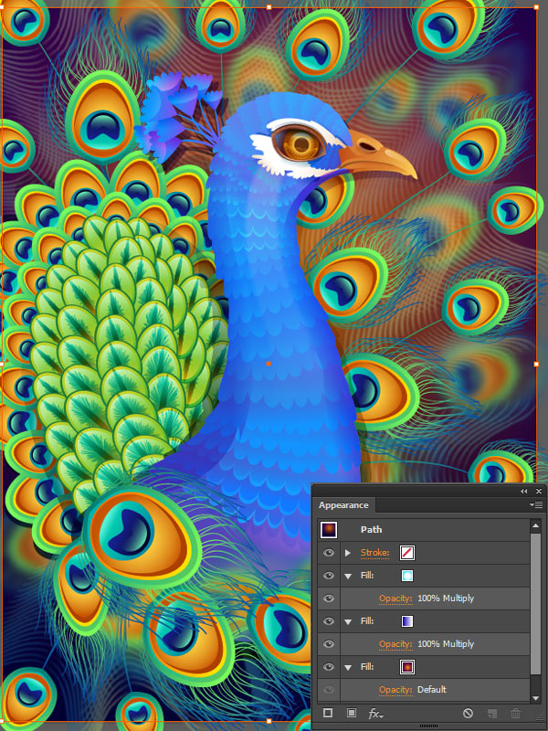
In this tutorial we will get to know one of the most useful Adobe Illustrator features – the Appearance panel – and draw a fabulous colorful peacock with the help of various effects.
The Appearance panel helps us to add as many fills and strokes as we need, applying various effects and arranging them in the necessary order, all applied to one object. Let’s start!
1. Draw a Vivid Eye
Step 1
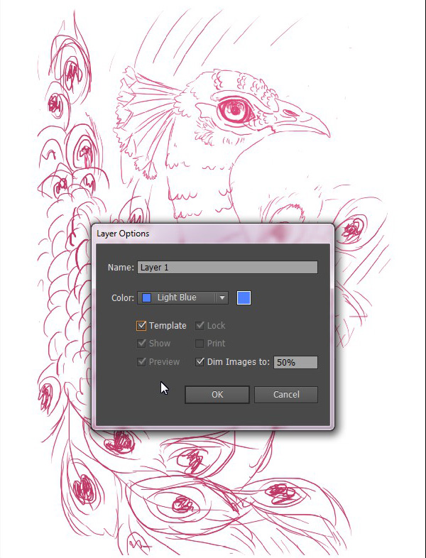
We’ll start from scratch by creating a New Document of 600 x 800px size and File > Place our doodle on the Artboard. Set the Blending Mode of your image to Multiply in order to make the lower objects visible under your sketch.
Double-click on your sketch layer and check the Template box, thus locking the layer and making the sketch more transparent for your convenience.
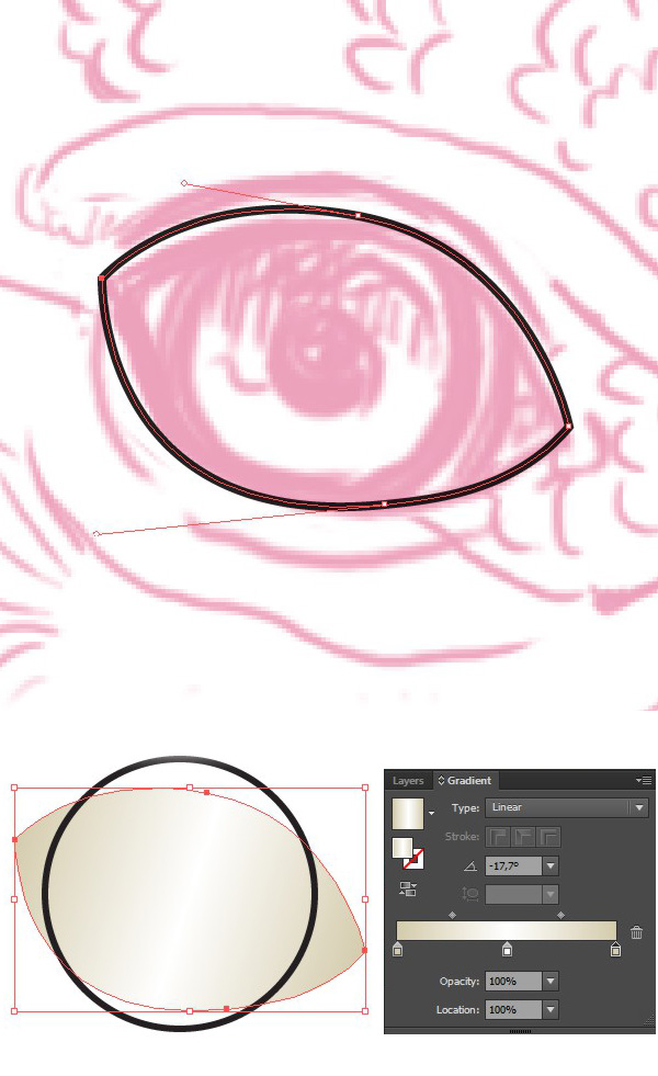
Step 2
Start by forming the basic eye shape, using the Pen Tool (P) and filling it with a three-colored linear gradient to make in more dimensional.Create the iris base above the eyeball with the help of the Ellipse Tool (L).
Step 3
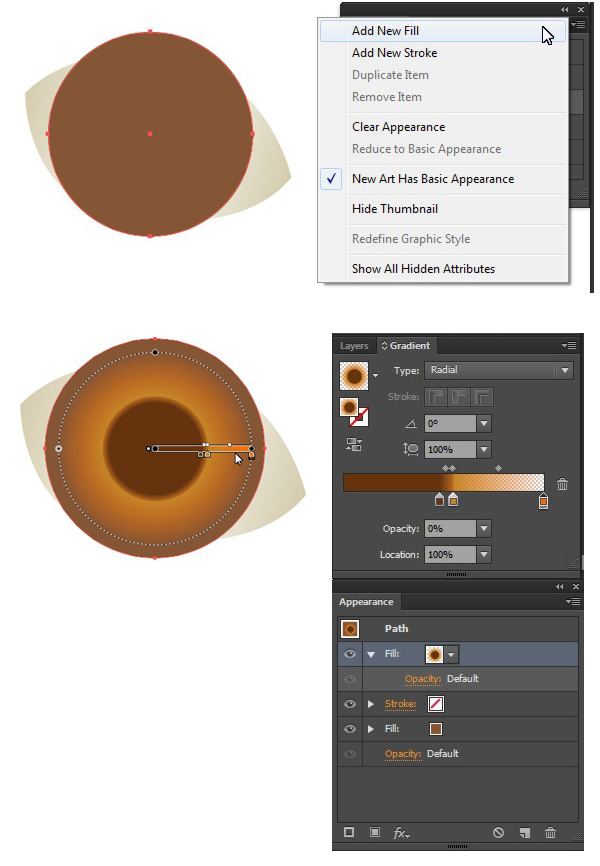
Fill the iris with a chocolate brown color and Add New Fill in the Appearance panel (Window > Appearance). Create a Radial Gradient from brown on one side, yellow in the middle and transparent orange on the other side, as shown on the screenshot, in order to form a pupil in the center of the iris.
Step 4
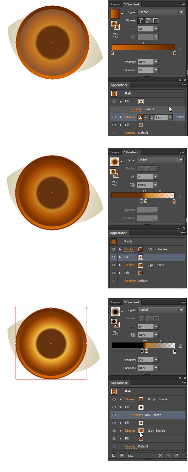
Move on and Add New Stroke of 2px Weight, Align Stroke to Inside inthe Appearance panel. Fill it with a two-colored Linear Gradient from dark-brown to bright orange.
Add another Stroke, setting it's size to 0.5px, filling it with solid brown color and Align Stroke to Inside. Edit the iris fill, adding new gradient with Blending Mode Screen, making the eye brighter.
Step 5
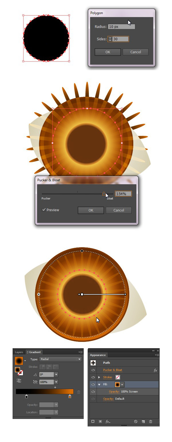
Continue adding details to the eye. Create a 30-sides shape with the Polygon Tool and apply Effect > Distort & Transform > Pucker & Bloat to it, turning our polygon into the sun-like shape. Fill the shape with aLinear Gradient from black to orange and switch it to Blending ModeScreen.
Step 6
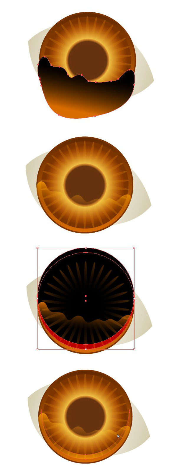
We need to add some reflections to the eye, making it more watered and realistic. Draw a curvy shape with the Pencil Tool (N) and cut off the unneeded part with the help of Shape Builder Tool (Shift-M).
Add a half-moon shape in the bottom of the eye by duplicating the basic circle shape and moving the copy a few pixels up. Delete the unneeded part and use the ScreenBlending Mode to make the reflections half-transparent.
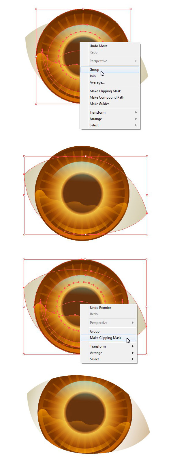
Step 7
When satisfied with all the details and reflections, group all the iris parts. Duplicate the basic eyeball shape and place the copy above all other objects (Shift-Control-]). Make a Clipping Mask to hide the iris in the eyeball shape.
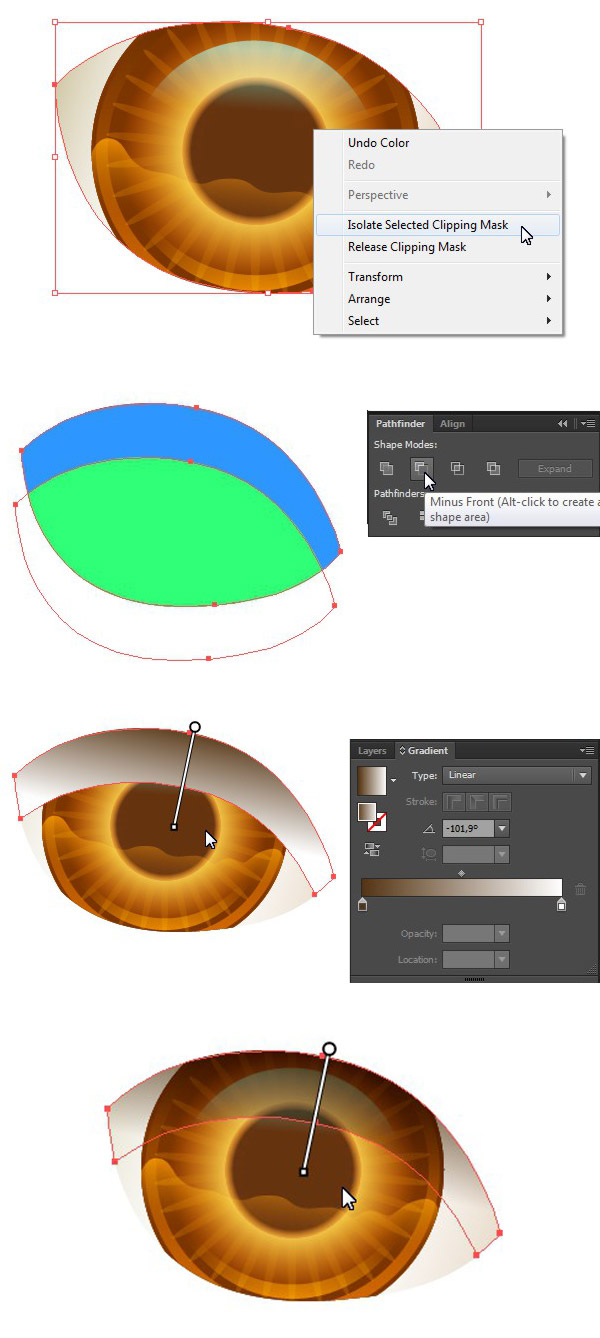
Step 8
Now let’s add a shadow from the eyelid. We can make it right inside the clipping mask. Duplicate the basic eyeball shape and move one of the copies as shown on the screenshot. Use the Minus Front function in thePathfinder panel to form an arched shadow shape. Fill the newly created shape with a Linear Gradient from brown to white and switch it to Blending Mode Multiply.
Step 9
Change the color of the eyeball to make it mysteriously dark and add the eyelid by forming a new shape under the eyeball. Fill it with dark skin-color and apply a default texture from the Swatches panel. You can find it in Swatches Libraries menu > Patterns > Basic Graphics > Basic Graphics_textures.
Change the size of the texture with the help of the Scale Tool (S) by checking the Transform Pattern box in the options and setting the Uniform Scale value to 40%.
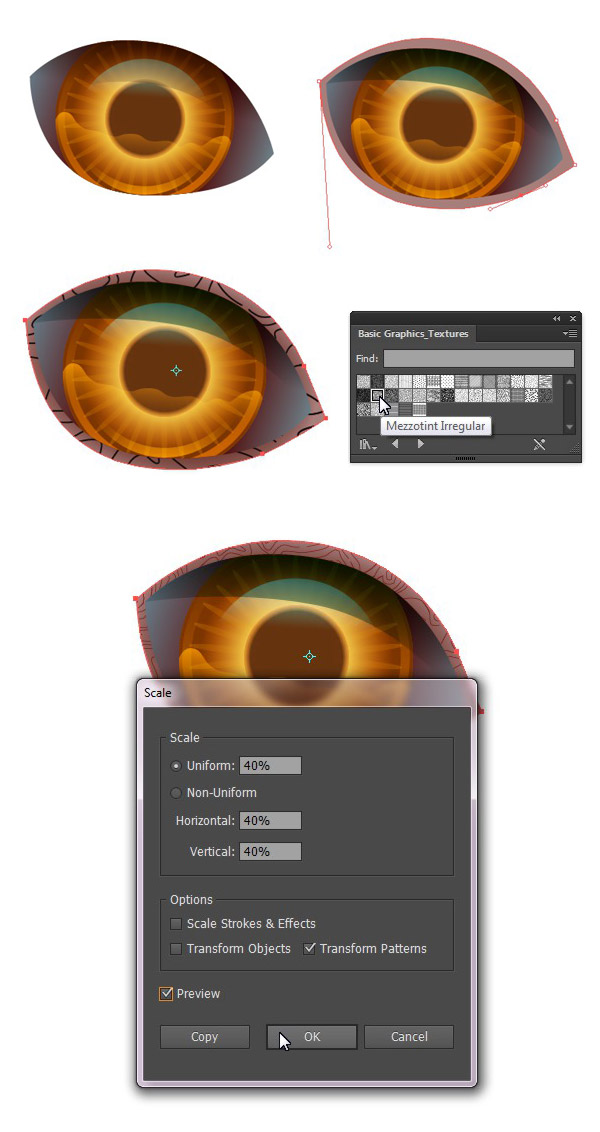
Step 10
Add more details to the eyelids by creating simple sharp shapes with the Pencil Tool (N) and using the Blending ModeMultiply in order to blend them nicely with the body.
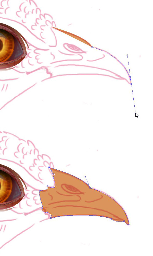
2. Render a Realistic Beak
Step 1
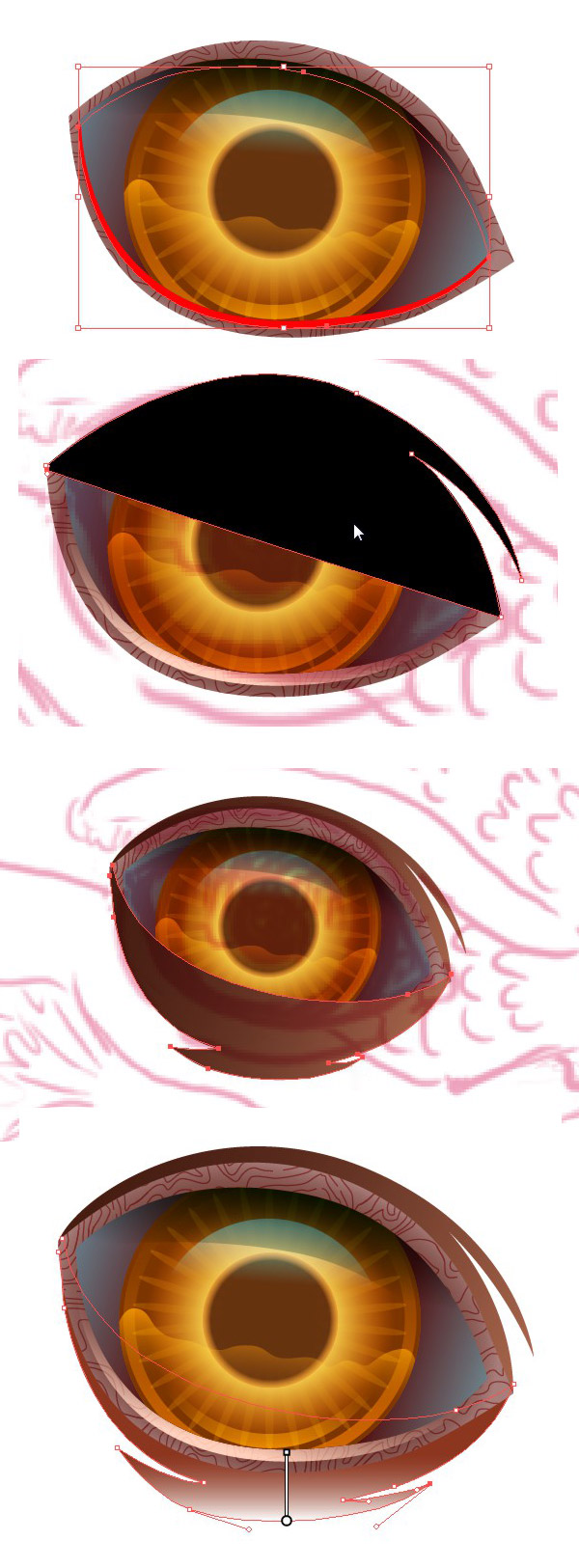
Outline your sketch with the help of the Pen Tool (P) and form a basic beak shape.
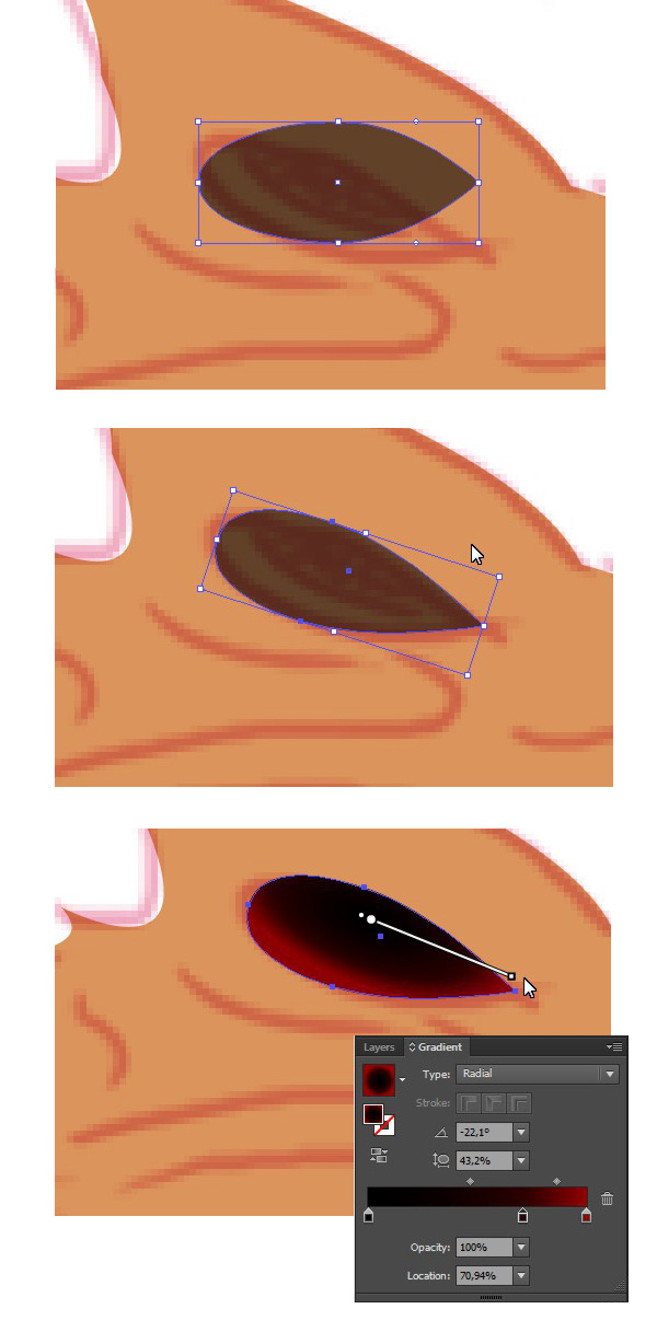
Step 2
Make a simple nostril by forming an ellipse and converting one of its anchor points to angle. Fill the new shape with a Radial Gradient.
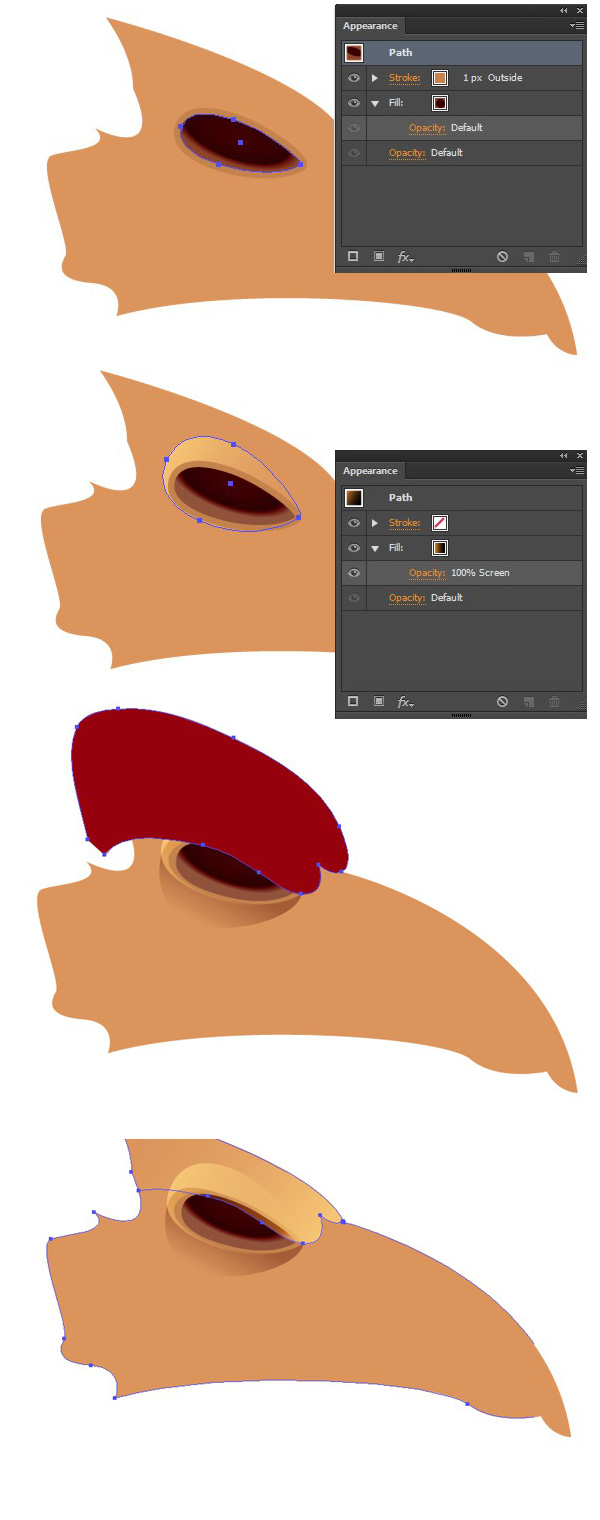
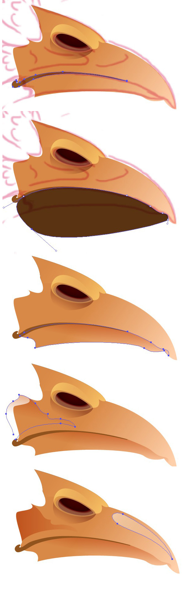
Step 3
Add several shapes for shadows and highlights to sculpt the natural parts of the beak, making it more dimensional and true-to-life.
Step 4
Apply a gentle Linear Gradient to the basic beak shape, making its tip slightly lighter. Use the Blob Brush Tool (Shift-B) to separate the beak into the upper and the lower “jaw” parts. Continue adding shadows, making the lower part darker. Finally, put a light spot on the upper side of the beak, making in more smooth and glossy, as if it reflects the light.
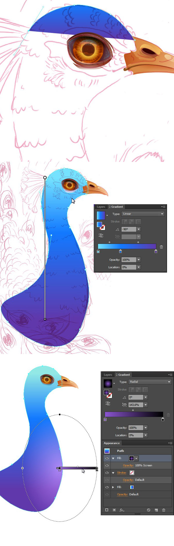
3. Create the Peacock's Head & Body
Step 1
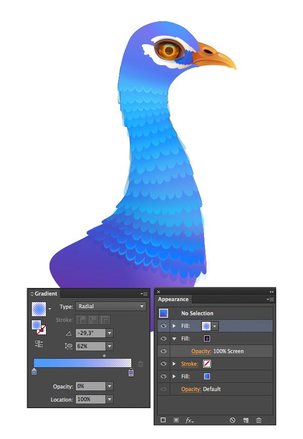
Start tracing your sketch from the peacock’s head and move further to form the basic body-shape. Fill it with a vibrant Linear Gradient from sky-blue on the top to violet in the bottom. Use the Appearance panel to add another fill with a Radial Gradient and put a bright lilac spot on peacock’s chest.
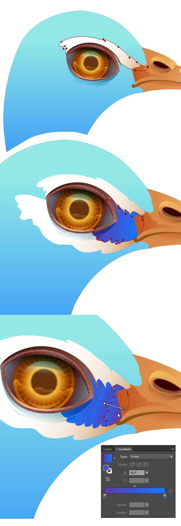
Step 2
Start adding the distinctive features on the peacock’s head – white plumage around the eye and tiny feathers running from its beak to the inner corner of the eye. Draw each feather group with a simple freehand shape using the Pencil Tool (N) and fill it with Linear Gradient from violet to sparkling blue.
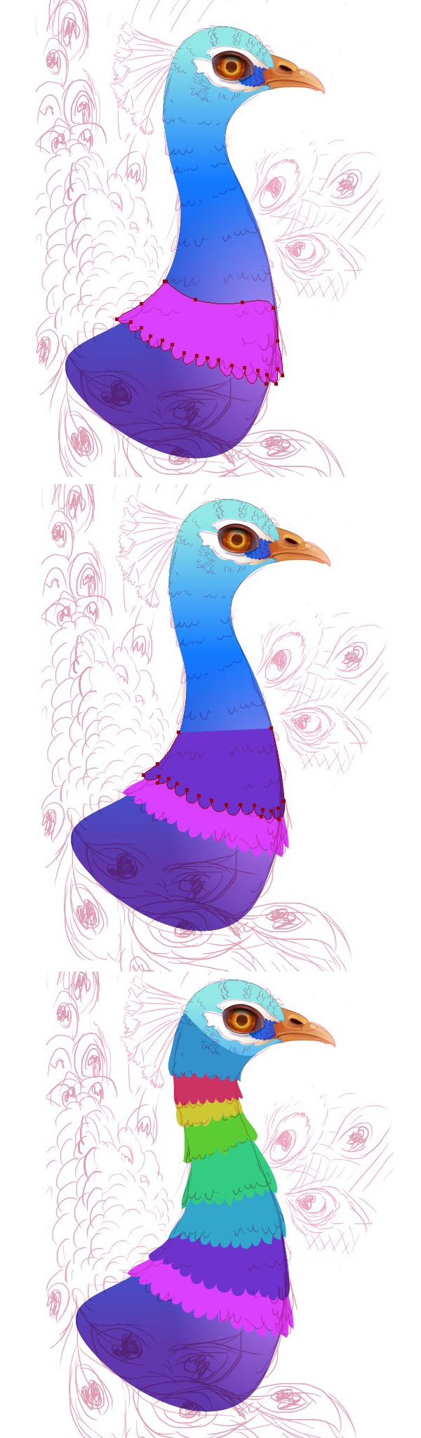
Step 3
At this step we start adding the feather groups gradually on the peacock’s body. Draw each shape one above the other, imitating the feather layers.
For more clarity, I’ve filled them with various colors on the screenshot in order to separate the layers from each other.
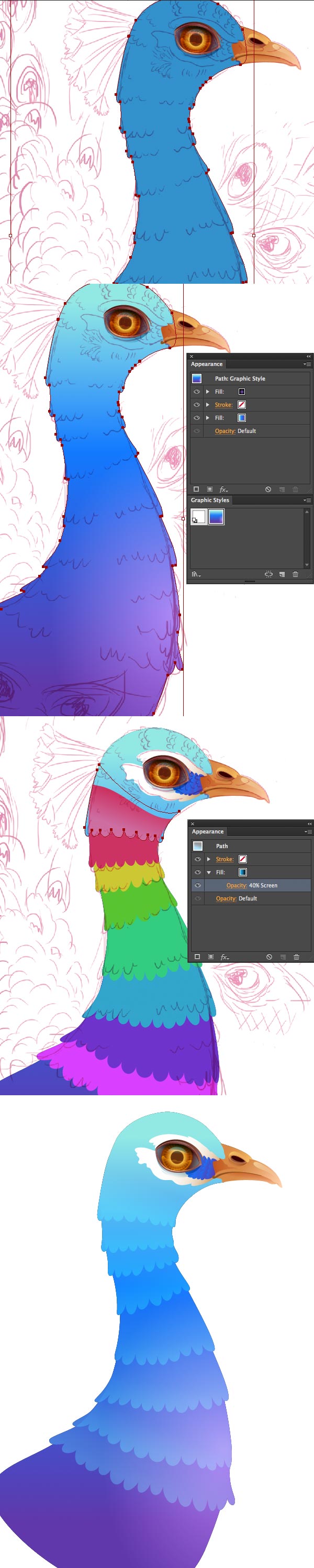
Step 4
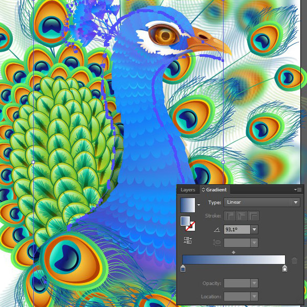
Select the basic body shape and drag it to the Graphic Styles panel. Now you can apply the same appearance to any object! Group all the feather layers and duplicate them. Select both the feather group copy and the basic body shape and Unite them in Pathfinder. If the color has changed, just restore it from the Graphic Styles. Start coloring the feather layers one by one, filling them with a Linear Gradient from blue to black and switching to Blending Mode Screen.
Step 5
Our peacock lacks details now, so let’s add more feathers to make it fluffier! Copy each feather shape and move it by holding the Alt key and dragging it down with the left mouse button. Arrange the feather shapes so that they fit nicely onto the peacock’s neck.
Step 6
Add a few shiny details to the plumage to make the character more radiant and whimsy. Step 7
To make the body more solid, let’s add another fill to the feathers with a radial gradient from shiny blue in the middle to transparent violet at the edge. I’ve also modified the body color slightly, adding a blue “cap” on the peacock’s head with the help of the Radial Gradient and the Appearance panel.
Step 8
Decorate the peacock’s head with several layers of feathers, just as we did with its body.
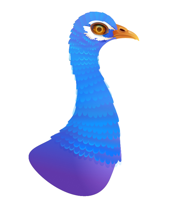
Step 9
This is how our peacock looks like fully feathered! As you can see, we have some transparent feathers left on both sides of the body. But don’t worry about that – just duplicate those layers and Unite them in Pathfinder, as we previously did with the very first feather group.
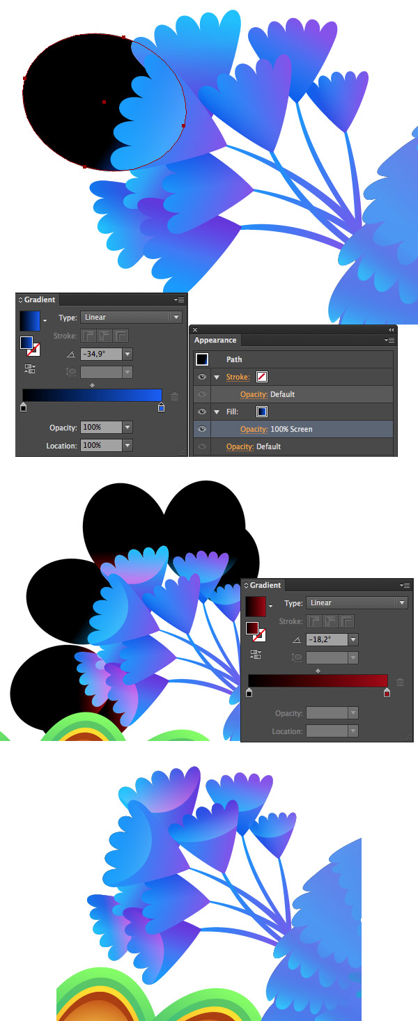
4. Make the Vibrant Tail Plumage
The distinctive feature of every male peacock – is its fantastic festive plumage. We’ll start forming the tail from the smallest group of feathers.
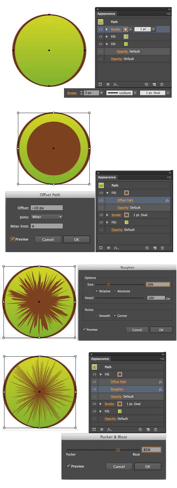
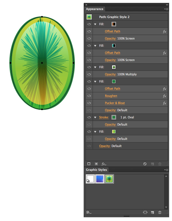
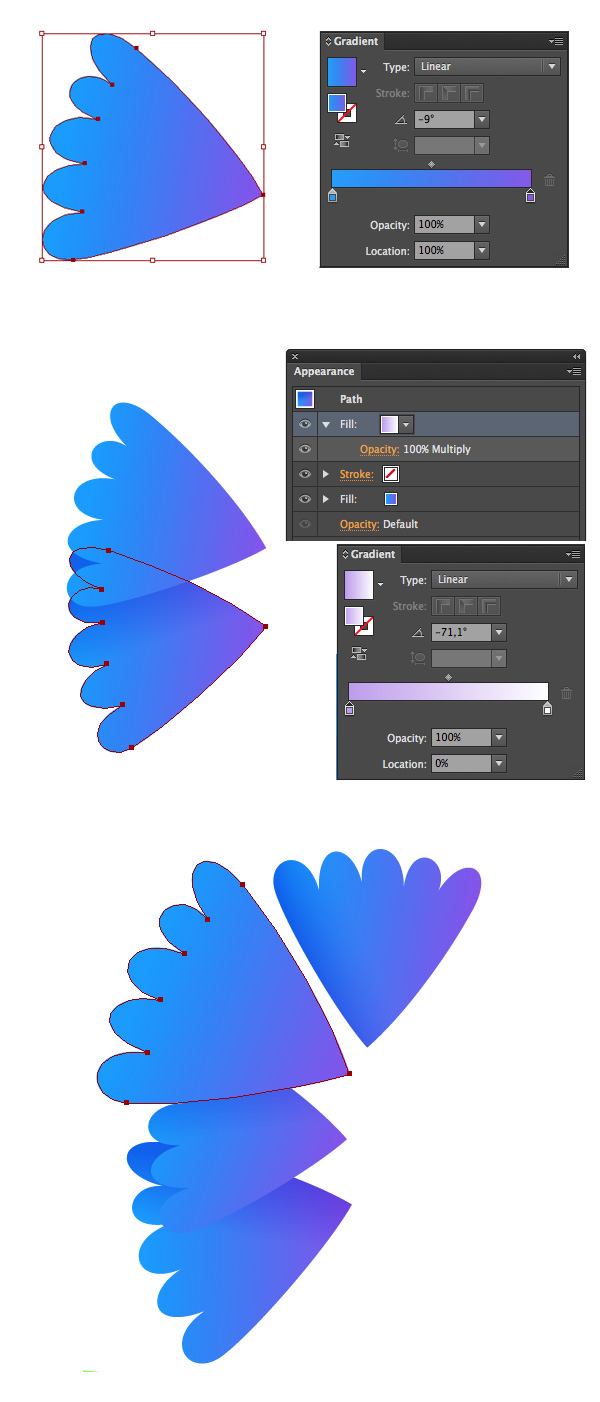
Step 1
First of all, let’s make a single shape and then just use its Graphic Style for all other elements.
Create a circle using the Ellipse Tool (L) and apply a gradient Fill and brown Stroke to it in the Appearance panel. Set theStroke Weight to 3px and choose 1pt. Oval brush in the Brushes panel to make our stroke more natural. Add New Fill of same color as the stroke. Select the Fill and go to FX > Path > Offset Path in the Appearance panel. Set the Offset Value to -10px and move to FX > Distort & Transform > Roughen to give our feather a nice “hairy” effect. Set the Size to 26% and the Detail value to 100 in the Roughen Options menu. At this step, the shape looks quite torn and messy. To make it more neat and detailed, apply the FX > Distort & Transform > Pucker & Bloat effect to the same fill, setting the bloat value to 85%.
Step 2
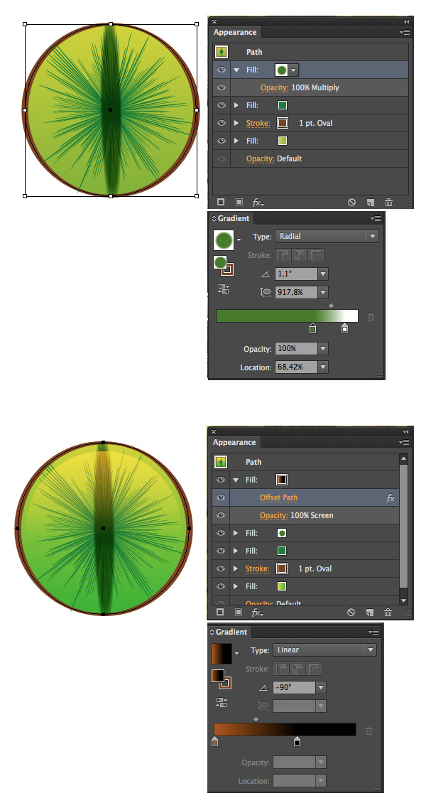
The convenience of the Appearance panel is hard to underestimate as it saves a huge amount of time, while you are still working with one and the only object and can easily change colors and effects of any fill or stroke you use.
Here I’ve switched the color of the “hairy” part to dark-green and added a new fill with radial gradient from green to white, setting the Blending Mode to Multiply. I’ve squashed the gradient using the Gradient Tool (G)to make it look like the cat’s eye.
Finally, add one more fill and make it slightly smaller with the help of the Offset Path effect. Apply a Linear Gradient from dark-orange to black and switch it to Blending Mode Screen in order to form a glossy highlight effect above our feather.
Step 3
Extrude the shape to make it move oval and check all the details in the Appearance panel. You can easily edit them if some of the effects deform after reshaping the feather.
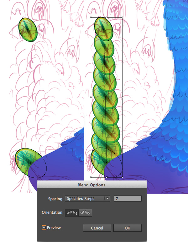
Step 4
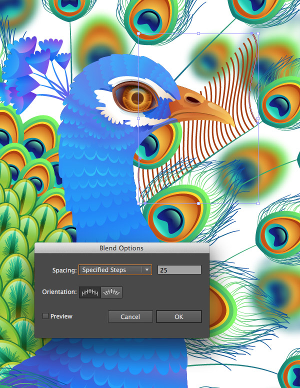
Now we need to form a tail. Place the created shape near the lower part of the peacock’s body. Put the second feather of a smaller size at some distance from the fist one, as shown on the screenshot.
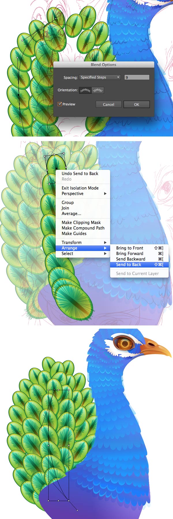
Finally, select both elements and go to Object > Blend > Make. Use the Blend Options to set the Spacing to Specified Steps, value equals 7.
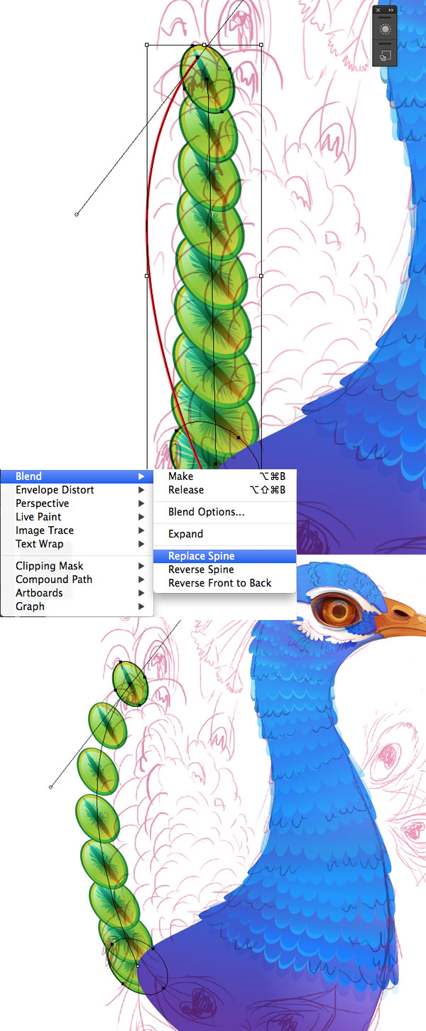
Step 5
Now we need to make our tail nicely curved. Draw an arched line with the Pen Tool (P). Go to Object > Blend > Replace Spine so that the elements will align to the selected arc.
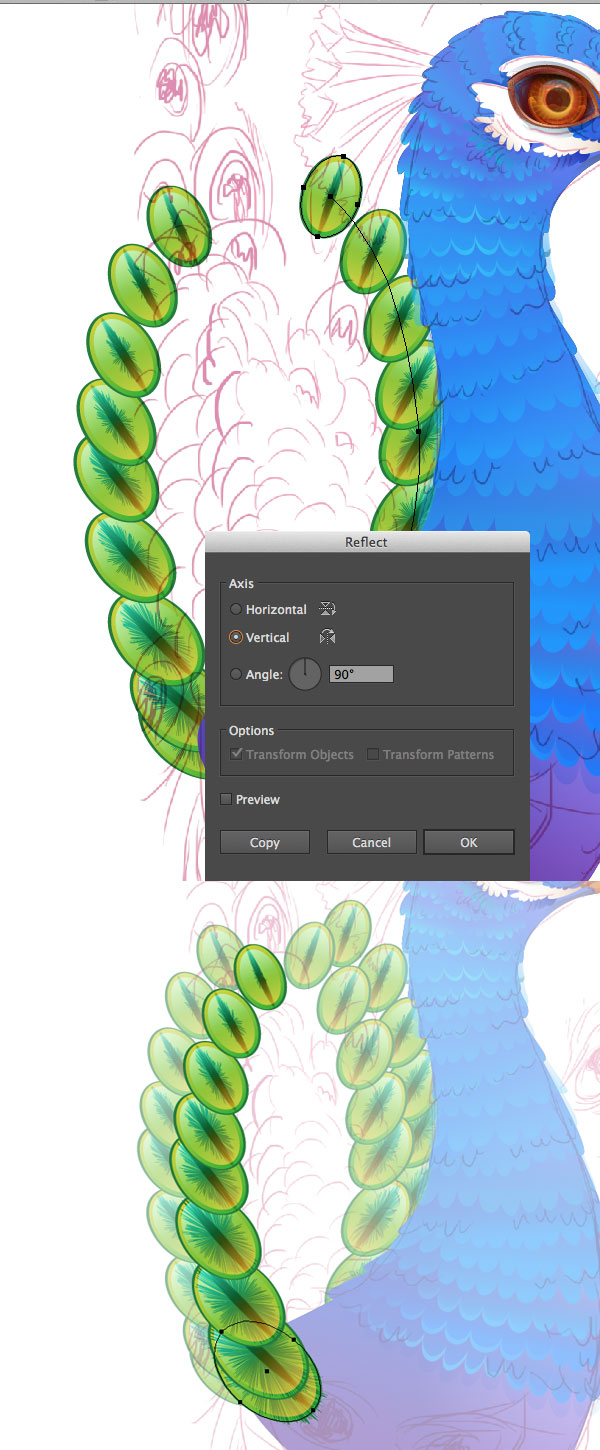
Step 6
Reflect the tail part over the vertical axis and continue adding new parts, making the tail more detailed.
Step 7
You can still change the Spacing value in the Blend Options and Rearrange any feather elements in the blend group, making the overall view more fancy and neat.
Step 8
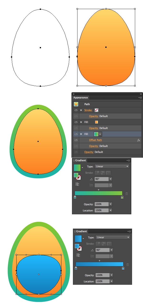
Let’s move on and create the famous peacock's “eye”-feather!
Start by forming and egg-shape out of the ellipse by moving its side anchor points down a bit. Fill the created shape with a gentle Linear Gradient from lighter orange on top to the darker orange in the bottom.
Use the Appearance panel to Add New Fill and apply the Offset Path effect, making it slightly larger than the basic shape. Take the Ellipse Tool (L) and form a new shape above, filling it with Linear Gradient of lighter and darker blue. Reshape the object, squashing it a bit, as show on the screenshot.
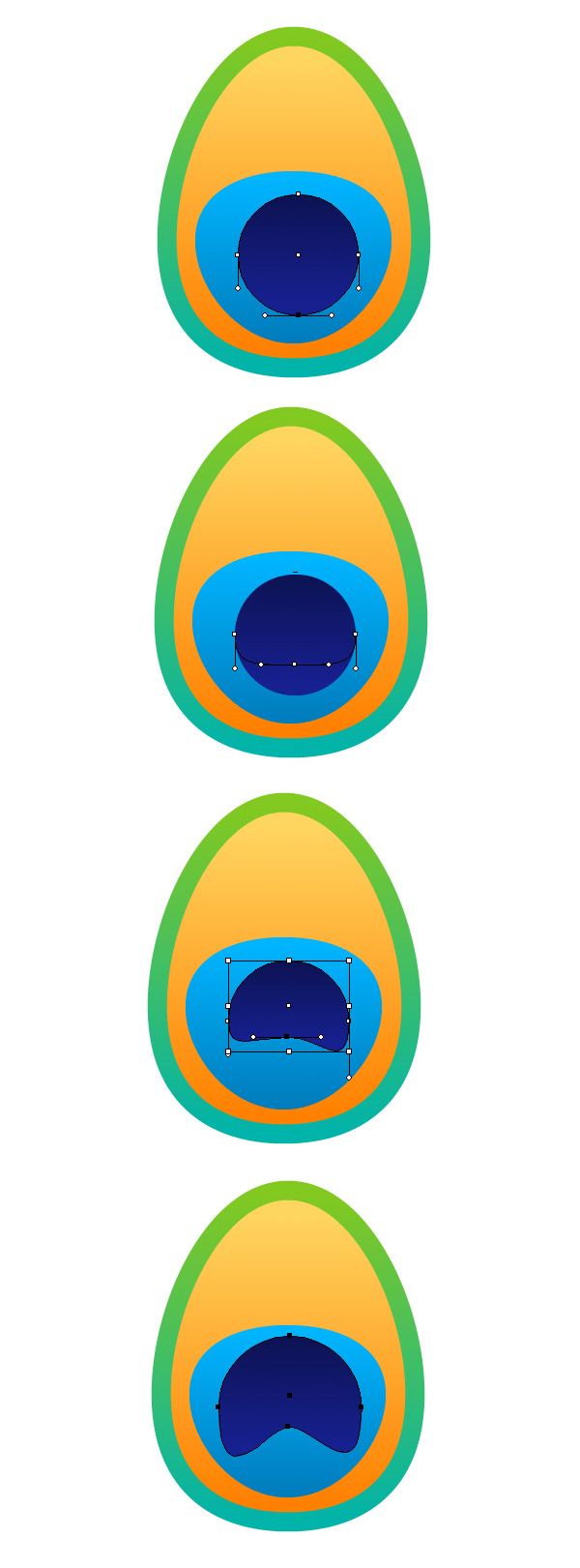
Step 9
Put another circle on top, filling it with night blue. Use the Direct Selection Tool (A) for moving its anchor points and reshaping the circle into a new shape, reminding a hoof print.
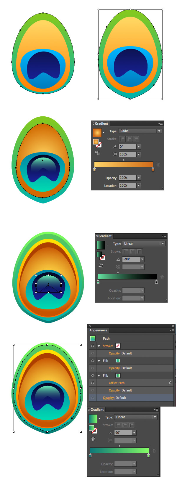
Step 10
Go to Object > Expand Appearance in order to break the feather into separate elements. Select the green shape and convert its lower anchor point to corner, making it more pointed.
Apply a Radial Gradient to the yellow shape, making it shiny and golden. Add a glossy green spot above the dark blue shape and switch it to Blending Mode Screen.
Finally, make the object more detailed and whimsy by adding a few shadows and highlights at the edges of our feather.
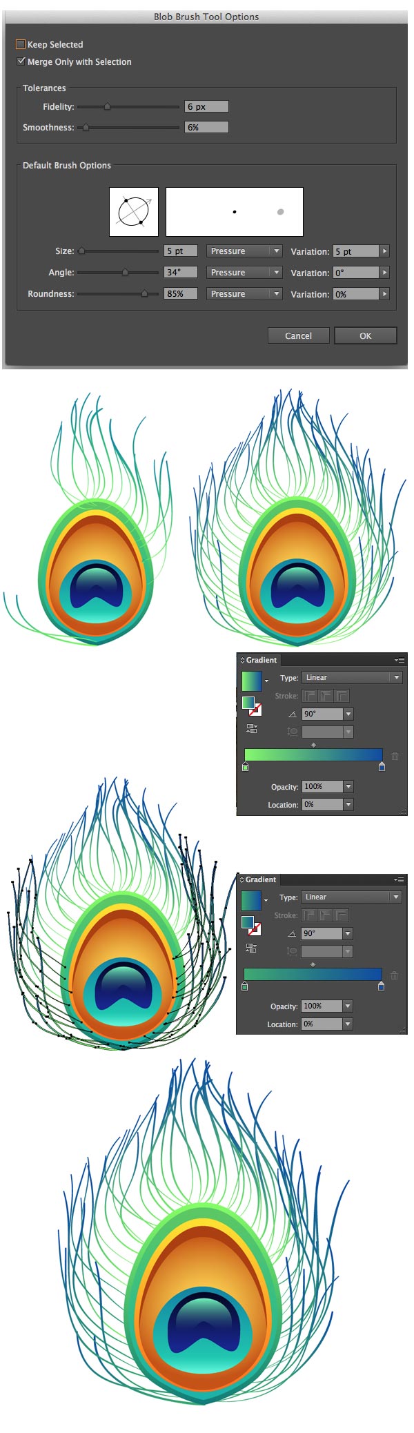
Step 11
Now grab the Blob Brush Tool (Shift-B) and start drawing out long hairlines around the feather. Apply a vivid green-blue gradient to the strokes. Put the hairlines behind our basic feather shape.
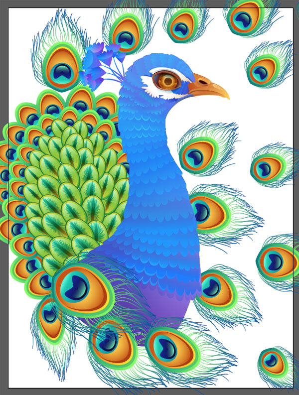
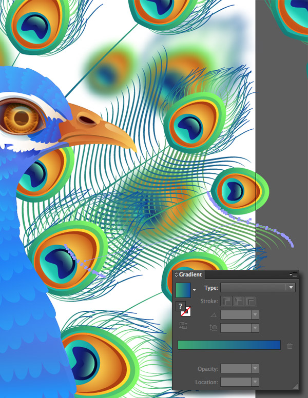
5. Render a Detailed Feather Filled Background
Step 1
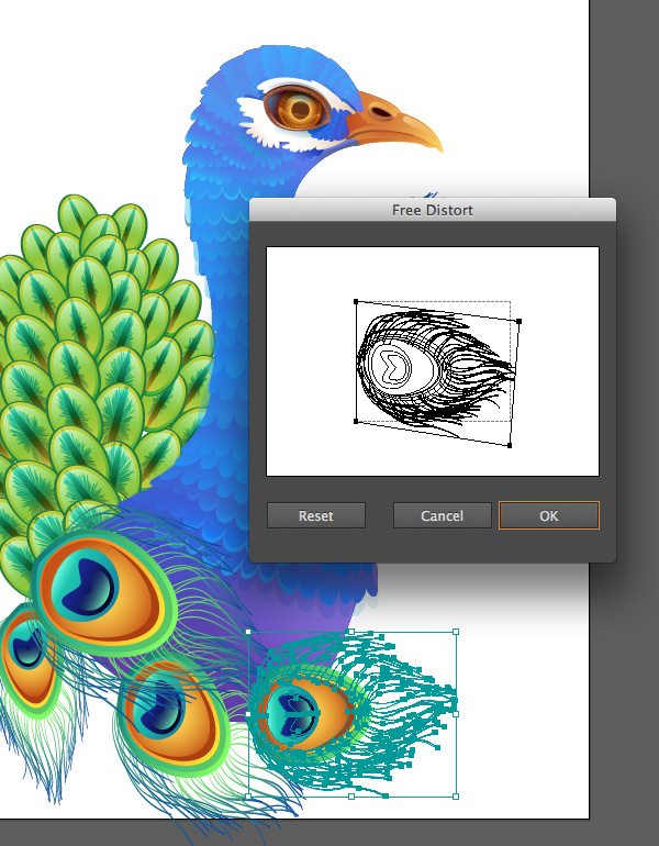
Now we can use the created feathers to make our picture more ornate. Put the biggest feathers above our peacock so that they cover the lower part of its body. Use the Effect > Distort & Transform > Free Distortfunction in order to change the perspective of some feathers, so that they fit into the composition nicely.
Step 2
Continue filling up the picture, this time using the “eye”-feather base and putting its copies behind the green tail-feathers, making the tail more rich and decorated.
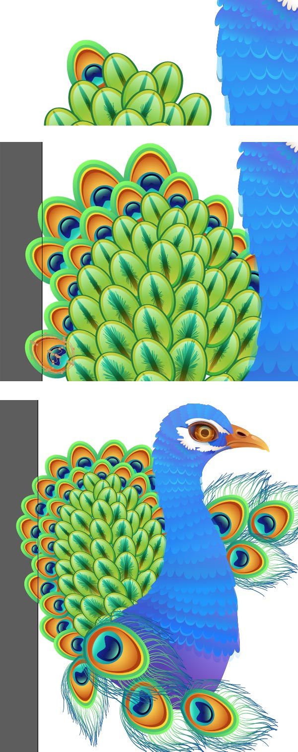
Step 3
Another distinctive peacock’s feature is a bunch of cute small feathers at the back of his head. Draw a few simple shapes using the Pencil Tool (N) and fill them with Linear Gradient from blue to lilac. Place one copy below the main shape and Add New Fill in the Appearance panel. Apply a Linear Gradient from lilac to white in the Blending Mode Screen in order to darken the shape and separate it from the upper element. Make more copies in order to create a fancy hairdo for our peacock.
Step 4
Make the feathers more shiny and fancy by putting an ellipse on each feather, filled with Linear Gradient from black to blue and to red. Switch the ellipses to Blending Mode Screen and delete the unneeded parts using the Shape Builder tool (Shift-M).
Step 6
Put the created bunch of feathers on the peacock’s head and start filling the background with details.
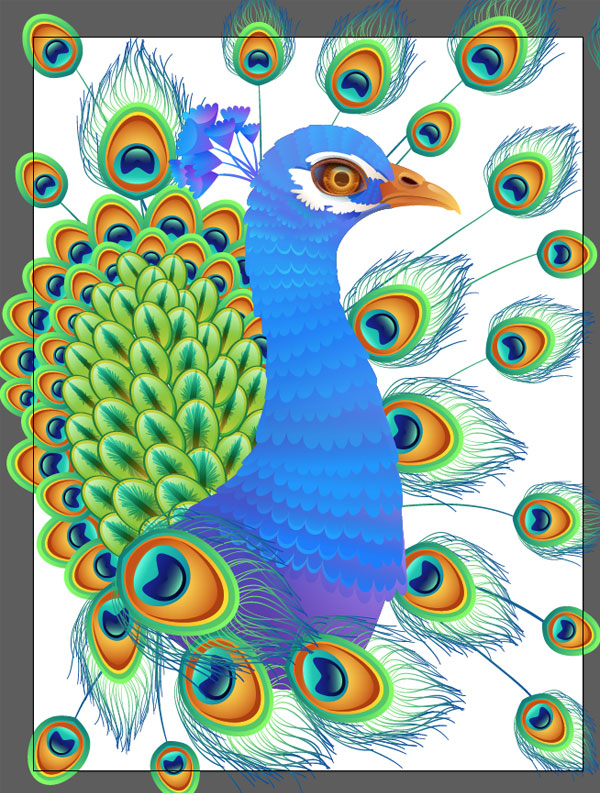
Step 7
Add long feather shafts using the Blob Brush Tool (Shift-B).
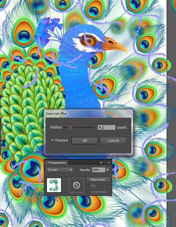
Step 8
Let’s deepen the composition by selecting some of the feathers and applying the following effect: Effect > Blur > Gaussian Blur. Now it seems the blurred feathers are at farther distance from the viewer.
Step 9
Draw a nice curved line with the Blob Brush Tool (Shift-B) and use the Blend Tool (W) to create a smooth feather. Use a gentle Linear Gradient from green to blue in order to fit the feathers into the overall color palette.
Step 10
Copy the created Blend group and place it on each feather shaft.
Step 11
Apply a Gaussian Blur effect and Blending Mode Screen to the created hairlines in order to make them more soft and transparent.
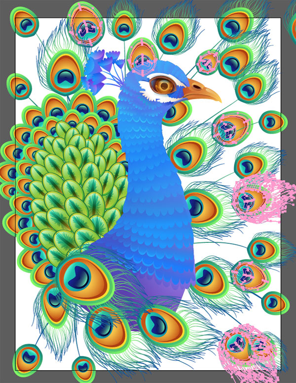
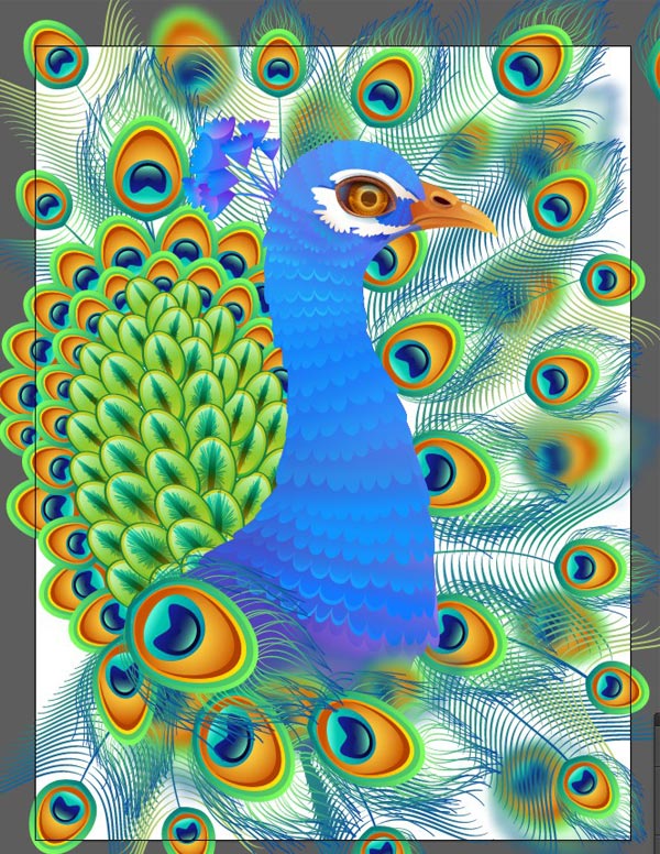
6. Add Minor Details to the Peacock and Background
Step 1
Now we need to add some shadows in order to emphasize the main object and to separate it from the background. Select all of the peacock’s parts and group them.
Step 2
Duplicate the selected group and Unite the objects in Pathfinder. Fill the newly created shape with Linear Gradient from dark-blue to white and switch it to Blending Mode Multiply in order to create a shadow from the peacock’s body.
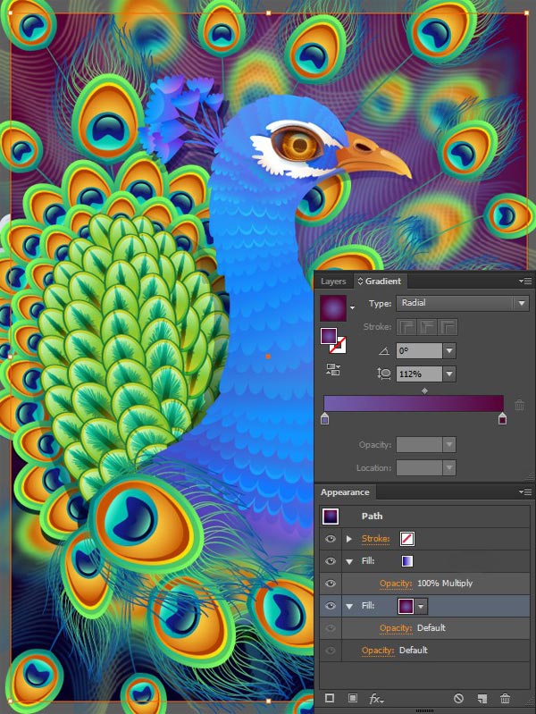
Step 3
It’s time to add some vivid color to the background! Create a rectangle of a size of our Artboard using the Rectangle Tool (M) and fill it with soft Radial Gradient from pale-lilac in the middle to dark violet at the edge. Use another fill to add a deep night-blue color in the bottom of the picture.
Step 4
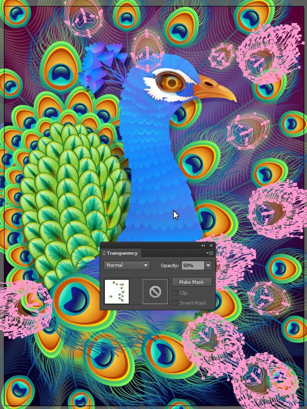
Select the blurred feathers and make them more transparent.
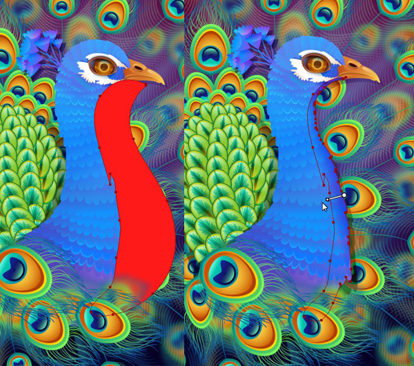
Step 5
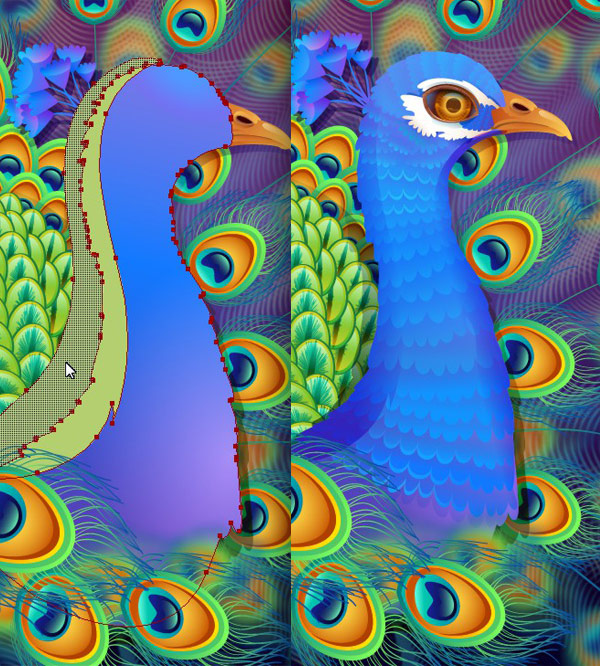
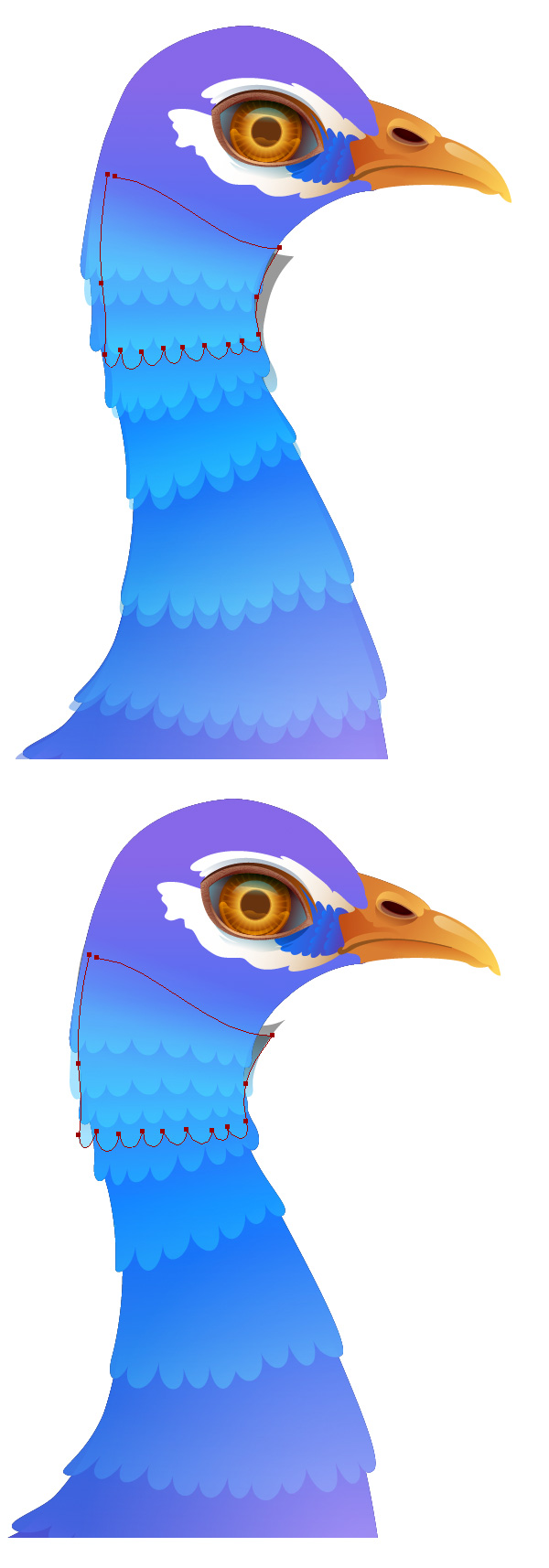
Let’s add some finishing touches to our peacock and make him more dimensional. Draw a free shape that partly covers the bird’s chest. Delete the unneeded part with the Shape Builder Tool (Shift-M). Turn the newly created object into a shadow in order to smooth out the edge of the peacock’s body.
Use the same method to create a shadow on the opposite side of the body.
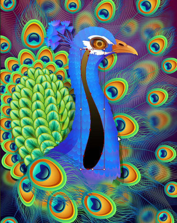
Step 6
Draw another curved drop-like shape in the center of the peacock’s body and fill it with Linear Gradient from black to greyish yellow.
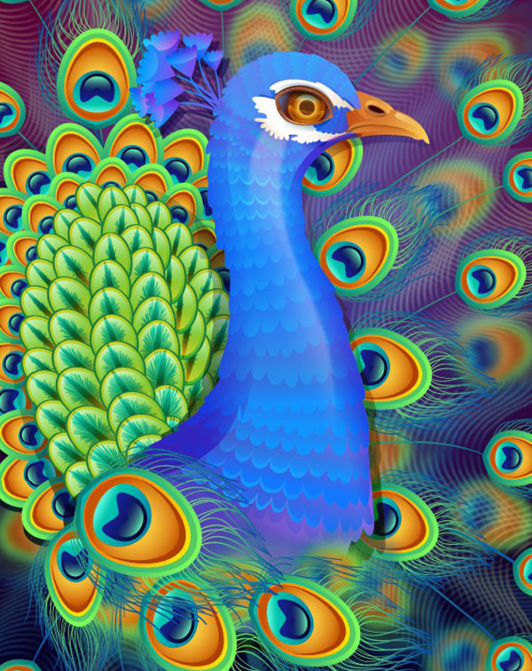
Step 7
Switch the Blending Mode of the created object to Screen in order to make a bright highlight on the peacock’s feathers.
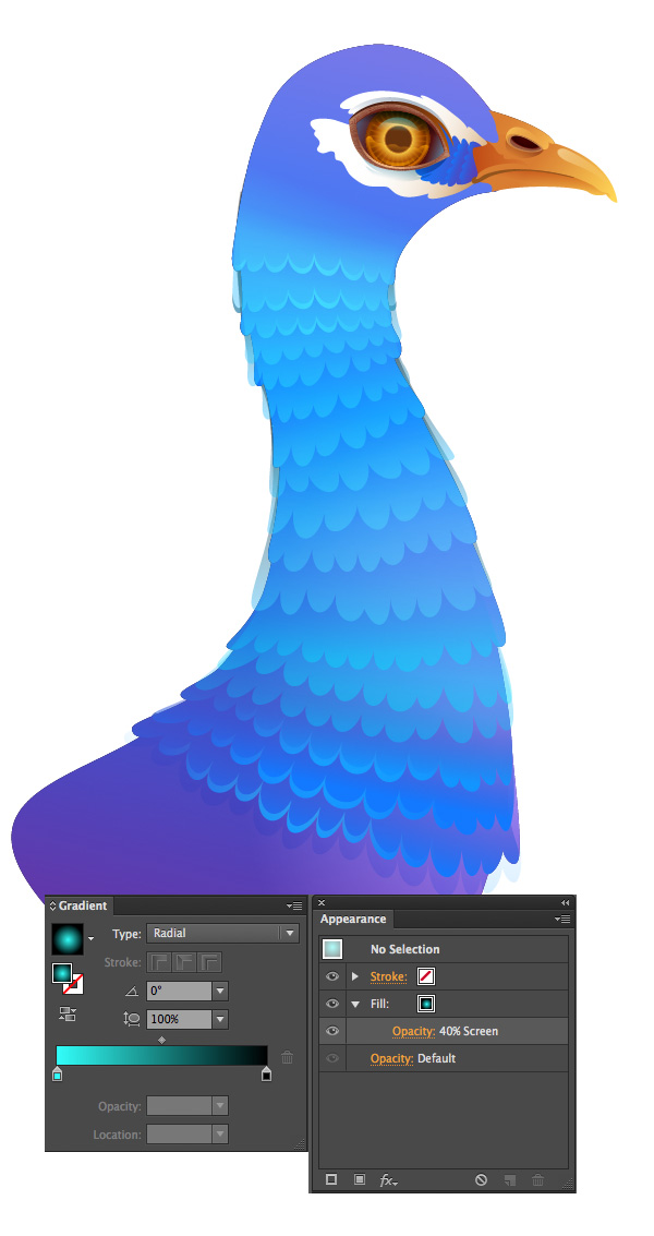
Step 8
Finally, observe the whole picture and add a few details here and there if you like. At this step I just add one more fill to the background – a radial gradient from blue on the edges to white in the center, switching it toBlending ModeMultiply, in order to make a nice vignette in the corners of the background.
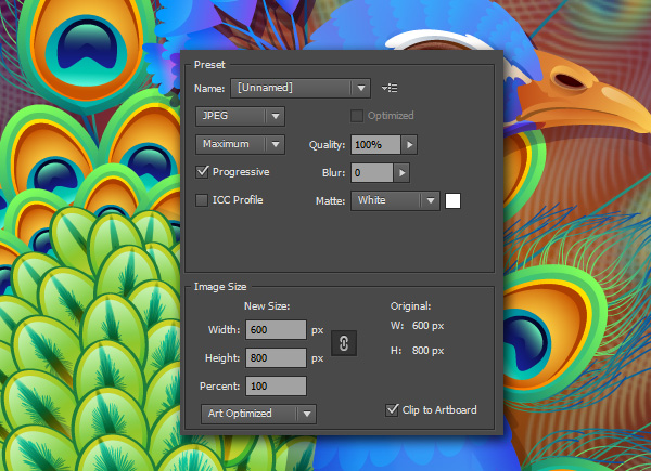
Step 9
When satisfied with the result, go to File > Save for Web (Alt-Shift-Control-S) and export your artwork. Don’t forget to check the Clip to Artboard box, so that the unneeded elements outside your Artboard won’t be included into the composition.
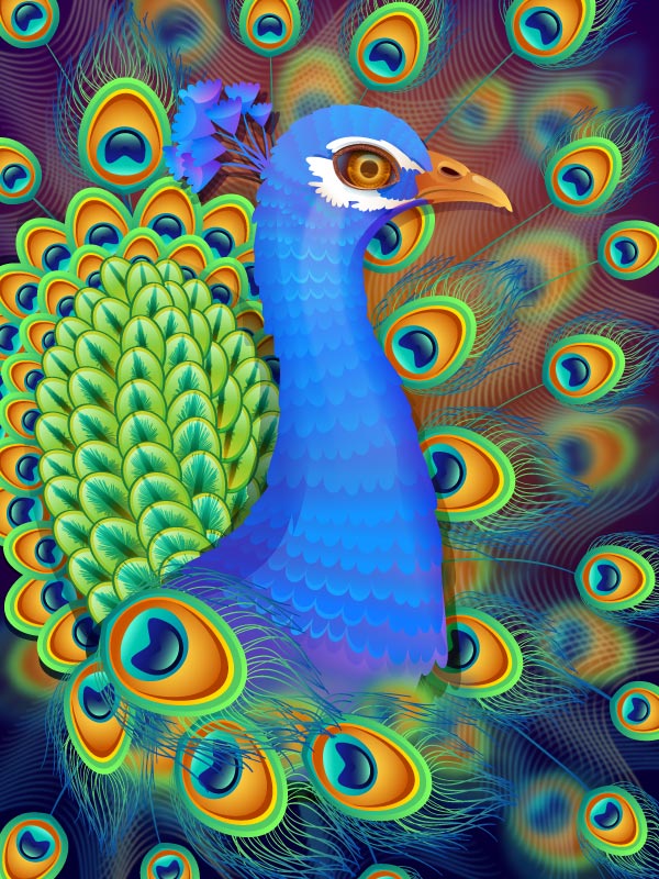
Voila! You’ve Finished Portraying the Glorious Peacock!
Good work! I hope you’ve assured in the convenience and advantages of the Appearance panel and found some useful tips and tricks in this tutorial! Have fun and never stop creating!


 Step 7